MDX
Let's get started with an example:
import { Title, Subtitle } from '@storybook/addon-docs/blocks';
import { PatternLoad, PatternPreview } from '@wingsuit-designsystem/storybook';

<PatternLoad patternId="grid">
  {(pattern) => (
  <>
    <Title />
    <Subtitle />

## Simple usage
....

<PatternPreview variant={pattern.getDefaultVariant()} columns="3" columns_width="25x50x25"/>
... More documentation.
  </>
  )}
</PatternLoad>
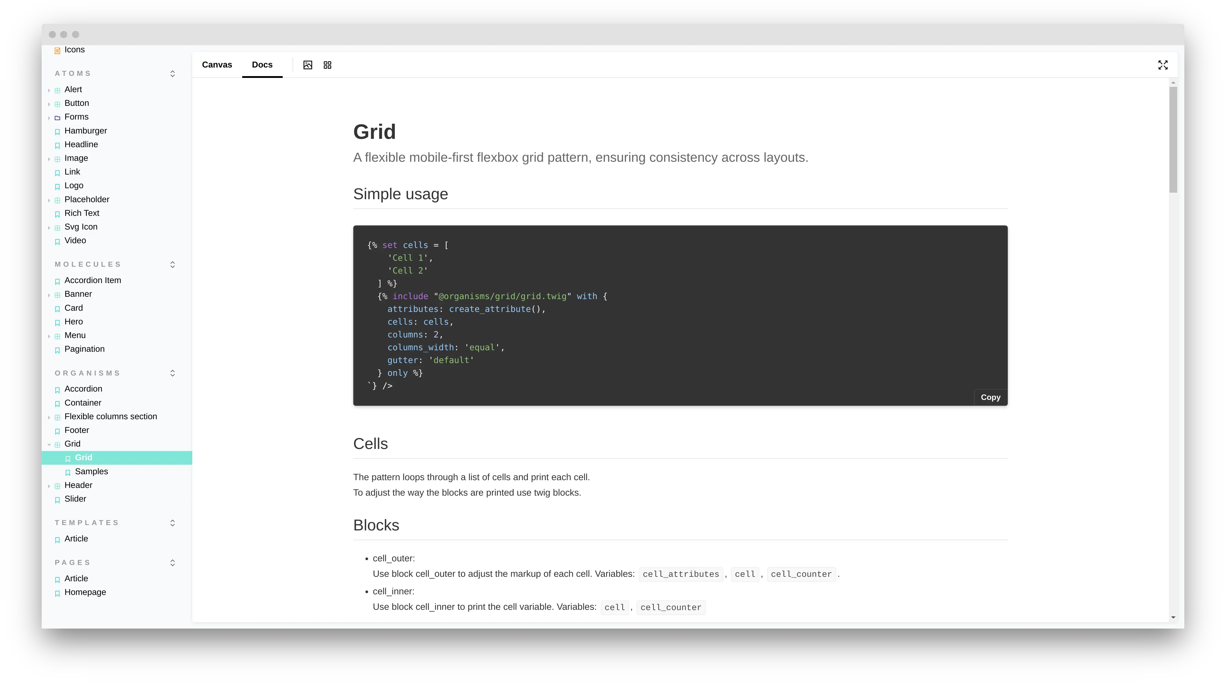
(The example is from organisms/grid/grid.mdx in your starter kit.)
With PatternLoad you can load any existing pattern. PatternLoad calls the load function asynchronous after the pattern is loaded.
PatternPreview renders the pattern with the preview data from the wingsuit.yml file. Each attribute is passed to the pattern.
Presentational template
To render a presentational template use:
const template = require('./presentational.twig');

<RenderTwig data={template}></RenderTwig>;
Pattern documentation components
PatternProperties
Pattern properties shows Fields and Settings from your wingsuit.yml as a tabbed table.
import { PatternProperties } from '@wingsuit-designsystem/storybook';

<PatternProperties variant={variant} />
PatternInclude
PatternInclude shows a sample twig include.
import { PatternInclude } from '@wingsuit-designsystem/storybook';

<PatternInclude variant={variant} />
PatternDoc
PatternDoc renders the complete automatic pattern documentation.
import { PatternDoc } from '@wingsuit-designsystem/storybook';

<PatternDoc pattern={pattern} showInclude />
Token documentation components
Typeset
To show your Typeset system use <Typeset ..>.
const fontSizes = {
  small: '0.5rem',
  base: '1rem',
  large: '2rem',
}
<Typeset fontFamily={fontfamily} classNamePrefix=".text-" fontSizes={fontSizes} />
Spacing
To show your spacing system use <Spacing ..>.
const spacing = {
  small: '0.5rem',
  base: '1rem',
  large: '2rem',
};

<Spacing spacing={spacing} classNamePrefix=".w-" direction="vertical|horizontal"></Spacing>

