Build CMS independent Twig Components in Storybook
A modern way of building, maintaining and documenting your visual driven twig components in storybook with an automated and opinionated integration workflow for your CMS.
1. Define your Design Tokens
Everything starts with well defined Design Tokens.
Collect all your spaces colors typography from your design before you start coding components. Good Design Tokens are a big timesaver!
TailwindCSS is the API for your design system. All tailwind.config.js settings are automaticly documented in Storybook.
module.exports = {
...
theme: {
colors: {
red: colors.rose,
teal: {
200: '#e6fffa'
300: '#b2f5ea'
500: '#00ffd1'
},
purple: {
200: '#faf5ff'
500: '#8000ff'
},
},
...
};
import { Meta, ColorPalette, ColorItem, Subtitle } from '@storybook/addon-docs/blocks';
const tailwindConfig = require('../../config/silo/tailwind.json');
const colors = tailwindConfig.tailwind.theme.colors;
<Meta title="Tokens/Colors" />
# Colors Matter
## A palette of great-looking, well-balanced colors.
<ColorPalette>
{
Object.keys(colors).map((key)=>{
const color = typeof colors[ key ] === 'string' ? [ colors[ key ] ]: colors[ key ];
const title = `.${ key }`;
return (
<ColorItem key={ key } title={ title } colors={ color } />
)
})
}
</ColorPalette>
Not every SCSS variable is a Design Token. Collect your Tokens in SCSS collections and export them. Wingsuit will document automaticly exported SCSS variables.
$primary: $blue !default;
$secondary: $gray-600 !default;
$success: $green !default;
$info: $cyan !default;
$warning: $yellow !default;
$danger: $red !default;
$light: $gray-100 !default;
$dark: $gray-800 !default;
$theme-colors: () !default;
$theme-colors: map-merge(
(
"primary": $primary,
"secondary": $secondary,
"success": $success,
"info": $info,
"warning": $warning,
"danger": $danger,
"light": $light,
"dark": $dark
),
$theme-colors
);
import { Meta, ColorPalette, ColorItem, Subtitle } from '@storybook/addon-docs/blocks';
const colors = require('tokens/exports/_colors.scss');
<Meta title=\"Tokens/Colors\" />
# Colors Matter
## A palette of great-looking, well-balanced colors.
<ColorPalette>
{
Object.keys(colors).map((key)=>{
const color = typeof colors[key] === 'string' ? [colors[key]] : colors[key];
const title = `.${key}`;
return (
<ColorItem key={key} title={title} colors={color} />
)
})
}
</ColorPalette>
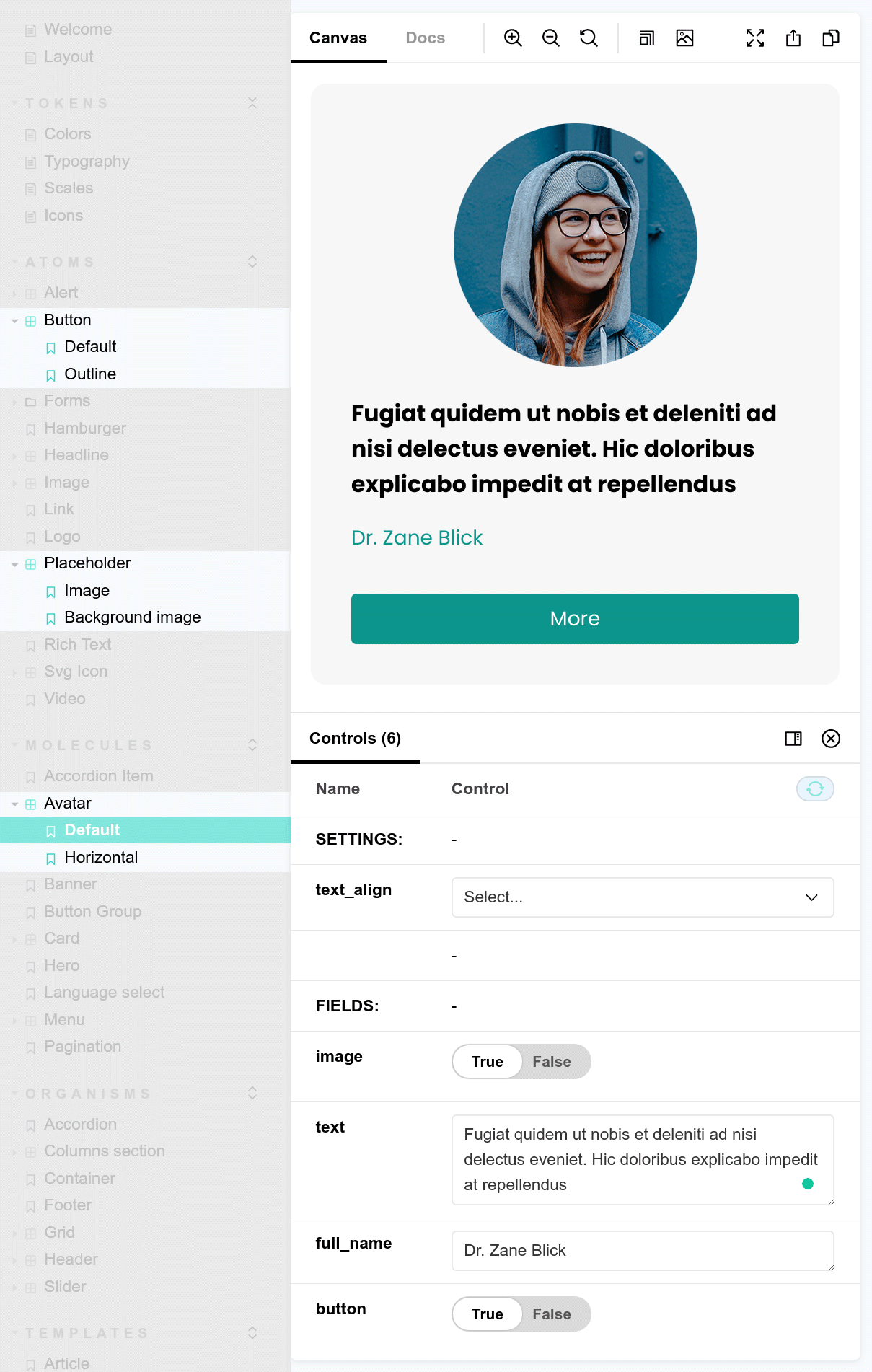
2.1. Build your UI Patterns
When you are done with your design tokens you can continue with building your patterns. Start with your smallest components first, followed by the larger ones.
A field holds your data from your CMS.
Define settings to make your pattern configurable. Typical settings are colors, alignment or sizes.
A variant is a configuration of the pattern.
use: "@molecules/avatar/avatar.twig"
label: Avatar
description: "An avatar represents an ...."
fields:
image:
type: pattern
label: Image
preview:
id: placeholder
variant: image
settings:
style: 1x1_xs_sc
text:
type: text
label: Text
preview:
faker: lorem.paragraphsettings:
text_align:
type: select
label: Text align
options:
left: Left
center: Centervariants:
default:
label: Default
horizontal:
label: Horizontal
{% set classes = [
text_align == 'center' ? 'text-center',
'bg-gray-100 rounded-xl overflow-hidden p-8',
variant == 'horizontal' ? 'flex flex-row'
] %}
{% set image_classes = [
'relative overflow-hidden flex-none w-48',variant == 'default'? 'h-48 rounded-full mx-auto',
variant == 'horizontal' ? 'h-auto -m-8 mr-8'] %}
<figure {{ attributes.addClass(classes) }} >
<div {{ image_attributes.addClass(image_classes) }}> {{ image }} </div>
<div class="pt-6 space-y-4 flex-1">
<blockquote>
<p class="text-lg font-semibold"> {{ text }} </p>
</blockquote>
<figcaption>
<p class="text-teal-600"> {{ full_name }} </p>
</figcaption>
</div>
</figure>
2.2. Document your components
Wingsuit provides Storybook DocBlocks as the building blocks to create full featured documentation right away from the wingsuit.yml.
avatar:
use: "@molecules/avatar/avatar.twig"
label: Avatar
description: "An avatar represent a user, and displays the profile picture."
fields:
image:
type: pattern
label: Image
description: The profile picture.
preview:
id: placeholder
variant: image
settings:
style: 1x1_xs_sc
text:
type: text
label: Text
description: A short description of the avatar.
preview:
faker: lorem.paragraph
full_name:
type: text
label: Full name
description: The full name of the profile.
preview:
faker: name.findName
button:
type: pattern
label: Button
description: Button with link to profile detail page.
preview:
id: button
variant: default
settings:
expanded: true
settings:
text_align:
type: select
label: Text align
description: Align the text of the avatar.
options:
left: Left
center: Center
variants:
default:
label: Default
description: Show
horizontal:
label: Horizontal
fields:
image:
id: placeholder
variant: image
settings:
style: 1x2_xs_sc'
You want to tell more about your component. With Wingsuit you can render your Twig component in your Storyboook MDX documentantion file.
import { Meta, Title, Subtitle } from '@storybook/addon-docs/blocks';
import { PatternLoad, PatternPreview } from '@wingsuit-designsystem/pattern-react/server';
<PatternLoad patternId="grid">
{(pattern) => (
<>
<Title />
<Subtitle />
## Simple usage
```twig dark
{% set cells = [
'Cell 1',
'Cell 2'
] %}
{% include "@organisms/grid/grid.twig" with {
attributes: create_attribute(),
cells: cells,
columns: 2,
columns_width: 'equal',
gutter: 'default'
} only %}
`} />
```
## Cells
The pattern loops through a list of cells and print each cell.<br/>
To adjust the way the blocks are printed use twig blocks.
## Blocks
* cell_outer: <br/>Use block cell_outer to adjust the markup of each cell. Variables: `cell`, `cell_counter`.
* cell_inner:<br/>Use block cell_inner to print the cell variable. Variables: `cell`, `cell_counter`
### Example: cell_inner
```twig dark
{% set cells = [
{content: '<div class="w-full h-20 bg-primary">1</div>'},
{content: '<div class="w-full h-20 bg-primary">2</div>'},
{content: '<div class="w-full h-20 bg-primary">3</div>'},
{content: '<div class="w-full h-20 bg-primary">4</div>'},
{content: '<div class="w-full h-20 bg-primary">5</div>'},
{content: '<div class="w-full h-20 bg-primary">6</div>'},
] %}
{% embed "@organisms/grid/grid.twig" with {
attributes: create_attribute(),
cells: cells,
columns: 2,
columns_width: 'equal',
gutter: 'default'
} only %}
{% block cell_inner %}
{{ cell.content }}
{% endblock %}
{% endembed %}
```
### Example: cell_outer
```twig dark
{% set cells = [
{content: '<div class="w-full h-20 bg-primary">1</div>'},
{content: '<div class="w-full h-20 bg-primary">2</div>'},
{content: '<div class="w-full h-20 bg-primary">3</div>'},
{content: '<div class="w-full h-20 bg-primary">4</div>'},
{content: '<div class="w-full h-20 bg-primary">5</div>'},
{content: '<div class="w-full h-20 bg-primary">6</div>'},
] %}
{% embed "@organisms/grid/grid.twig" with {
attributes: create_attribute(),
cells: cells,
columns: 2,
columns_width: 'equal',
gutter: 'default'
} only %}
{% block cell_outer %}
<div>
{{ cell.content }} + { cell_counter }
</div>
{% endblock %}
{% endembed %}
```
## Column widths
The pattern comes with most common column widths configurations like 50x50 or 33x66.
If you need additional configuration you can extends the columns configuration inside the `grid.wingsuit.yml`.
```yaml dark
columns:
2: << Columns count
equal: 'grid-cols-1 md:grid-cols-2' << Column width 50x50
'66x33': 'grid-cols-1 md:grid-cols-66/33' << Column width 66x33
'33x66': 'grid-cols-1 md:grid-cols-33/66' << Column width 33x66
```
## Gutter
To configure the spacing between the columns use the gutter configuration in the grid.wingsuit.yml.
```yaml dark
gutter:
...
default: 'gap-4 md:gap-5 lg:gap-7'
...
```
## Examples
### 4 equal columns.
```twig dark
{% include "@organisms/grid/grid.twig" with {
cells: cells,
columns: 4,
columns_width: 'equal',
gutter: 'default'
} only %}
```
<PatternPreview variant={pattern.getDefaultVariant()} columns="4" config="equal"/>
### 3 Columns with 25% 50% 25%.
```twig dark
{% include "@organisms/grid/grid.twig" with {
cells: cells,
columns: 3,
columns_width: '25x50x25',
gutter: 'default'
} only %}
```
<PatternPreview variant={pattern.getDefaultVariant()} columns="3" columns_width="25x50x25"/>
</>
)}
</PatternLoad>
3. Make Love.
After finalizing your component, you can easily use it in other apps like Drupal.
With UI Patterns no code is needed. The UI Patterns ecosystem offers a lot of modules that help you to manage the mapping without presenter templates. But there are still corners in Drupal where you need a presenter templates.
Don't forget to run yarn ws dev drupal
{% set button %}
{% include "@atoms/button/button.twig" with {
"text": "More"|t,
"link": content.url
} %}
{% endset %}
{% include "@molecules/avatar/avatar.twig" with {
"full_name": content.field_full_name,
"text": content.body,
"button": button
} %}
If you don't use Drupal install the cms app with yarn ws generate-app
and run yarn ws dev cms
to compile your CSS and templates.
You can also install the drupal app with yarn ws generate-app
and run yarn ws dev drupal
{% set button %}
{% include "@atoms/button/button.twig" with {
"text": "More"|t,
"link": content.url
} %}
{% endset %}
{% include "@molecules/avatar/avatar.twig" with {
"full_name": content.field_full_name,
"text": content.body,
"button": button
} %}
Try it now!
Get started using the automated command line tool. This command creates a Wingsuit demo project. The demo page uses the atomic design principle to structure the patterns..
npx @wingsuit-designsystem/cli init -k tailwind
npx @wingsuit-designsystem/cli init -k bootstrap
npx @wingsuit-designsystem/cli init -k vanilla-tailwind
# Add "cms" app and configure the `distFolder`, `assetAtomicFolder` to
# your template folder in your `wingsuit.config.js`:
yarn ws generate-app
# Start your app:
yarn ws dev cms
npx @wingsuit-designsystem/cli init -k vanilla-scss
# Add "cms" app and configure the `distFolder`, `assetAtomicFolder` to
# your template folder in your `wingsuit.config.js`:
yarn ws generate-app
# Start your app:
yarn ws dev cms
You might also try ...Drupal Kickstarter
Wingsuit Kickstarter is the fastest way to start your Drupal project with Wingsuit. The Kickstarter uses UI Patterns to map Patterns to Drupal and Acquia Blt for automation.